Pitfalls and prizes of ensuring quality mobile apps
Bringing quality to the new Guardian mobile app went far beyond traditional QA practices
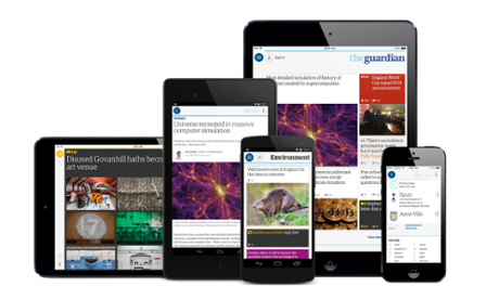
The Guardian’s QA team has worked extensively with native mobile apps for several years, so when we began working on the next generation of the Guardian’s app we were aware of the difficulties that we were going to face when testing and ensuring the quality of the app. Principally, these would be getting test coverage across a wide range of devices and operating systems under hugely varying network conditions. Overcoming these obstacles in a way that can provide as much coverage as possible, without requiring an impractical level of QA resource, is the challenge of mobile testing.
Typically with the initial testing phase of mobile apps, features are developed and tested under very “sterile” conditions, using a consistent WiFi connection on devices that are well known to the developers and QAs. The reality, however, of mobile devices is that every device is different, even within devices of the same model – each user has a different combination of settings and apps. It is possible to test across a wide range of devices and emulators, but this will not come close to covering a significant percentage of your audience: our apps are available globally to over 6,700 unique types of device.
Connectivity can also vary wildly within a short period of time, meaning that data is not going to be handled in a conventional manner. It is straightforward to test using throttled connections to produce a slow connection, or gradually walk through different areas of a building to create mild fluctuations, however this is not an accurate reproduction of a user travelling through various signal zones. For example, we learnt a lot about our app when I took a trip to France, and used it on Eurostar. My signal fluctuated greatly as I hurtled through different signal areas, lost connection completely while in the tunnel, then re-emerged on a completely different network at the other end. Enjoyable as it would be for the QA team, we can’t send people under the channel every time we want to test connectivity.
The conventional approach to a problem requiring inordinate QA resource would be to automate as much testing as possible, which does provide value in the case of mobile testing. This doesn’t solve the problem of the endless permutations in device configurations and connections, however, as the tools do not exist to accurately and quickly create the situations in which to run your tests.
Therefore the solution is to get your apps in the hands of as many users as possible during as much of your development process as you are able to. For the next generation Guardian app, we took the following steps:
Everyone on the team uses the app
By ensuring that it is easy for everyone on the team, including non-technical staff, to be running up-to-date builds of the apps on their devices, you’ve already got a guaranteed, if small, audience to give feedback, report bugs, and generate metrics.
UX sessions
At the Guardian, we are fortunate to have an excellent lab for UX testingwith real users. We ran several sessions throughout the project with existing and prospective users to establish usage patterns and gather feedback. Everyone from the team attended these sessions, and while not directly a QA process, seeing users at first hand running early builds of the apps was able to greatly inform our development direction and QA process. You can read more about these sessions in this excellent articleby my colleagues Mario Andrade and Penny Allen.
Internal beta
As soon as the apps were at the point where users could read content, we rolled out an internal beta available to everyone in the company. This meant that they were running a barebones, very buggy app, however as soon as a new feature was complete, the beta would be updated to include it. It was a very unusual experience as a QA to be actively encouraging releases with bugs, but bugs are par for the course in a beta.
External beta
With a couple of months to go until launch, we released a version of our old Android app that invited users into a beta of the new app. This gave us several thousand users, all over the world, running the new product daily.
Crowdsourced testing
While the external and internal betas were aimed at more general use, we also took advantage of a crowd testing platform to run short cycles of testing aimed at specific areas of functionality, using a global base of professional testers.
Using any of these steps will help improve the quality of your apps, although depending on the circumstances that you are developing in, not all can be employed by everyone. If you are taking any of these approaches, though, it is essential to ensure that you are getting as much value as possible from your pre-release users:
Tracking
All apps should track usage, although more often than not implementing tracking is one of the last features to be added to an app. To get early user testing to work, tracking is vital. Only by knowing what areas of your app your users are using, when they’re using it, what device they are using etc can you truly understand how much risk you are averting for your project.
Understand the implications of the data you are seeing
Having tracking in place is one thing, but that only gives you the data. You need to understand this data, understand what its implications are for your testing, and be confident of your sample. For example, we found that while our iOS users were evenly spread across OS versions and devices, the Android users tended towards using more recent devices, far more than the audience for our old app. This meant that in order to ensure quality for our users on older devices, we needed to steer more of our regression testing effort than expected towards these older devices. It is also essential that you are able to trust your sample data. If there are doubts, or a lack of confidence in the quality of your tracking, or the spread of users in your sample group, your data is immediately undermined.
Crash logging
As well as tracking usage, crash analytics can further enhance your understanding of how your app is performing. The average beta user cannot, and should not be expected to provide detailed reproduction steps and valuable assets, such as a stack trace for any crash they may experience. By employing crash tracking tools such as Crittercism orBugSense you can get this data for every crash experienced by your users. Again, as per tracking, this is something you should always be doing with your apps, but by ensuring it is in place early, you can get maximum value from your beta users.
Keep your users engaged
Getting users on board for a beta is just the first step. You are asking users to give you feedback and report issues, while using features that may not be complete, so it really is the users helping you, rather than you giving the users a sneak preview of your new app. Therefore, keeping your users actively engaged should be viewed as a priority of any beta project. For example, we encouraged users to report any bugs or feedback on the Google+ page for the Android beta, and made sure to respond to them and advise them when fixes for their issues were on the way. The result was a thriving community around the beta, which you can see and join here. Since our initial launch, we are continuing to launch our new in-development features to the beta group first.
While these steps cannot take over the full responsibility of testing an app, as features must be finished, or at least in a viable state before being passed to users, they will greatly increase your coverage and address most of the issues around OS version and device fragmentation. Additionally, they will produce a vast amount of data that can inform a risk based approach to regression & automated testing, and has informed our approach to our new Hybrid2 automation framework, which we hope to be writing about in the near future. It must be remembered however, just as with all other approaches to testing, it is in essence a risk-based approach, and cannot be considered foolproof. The whole endeavour is steered towards reducing risk when it comes to releasing the app to production, however that does mean it completely eradicates risk. For example, you may have a sample group of 5,000 users running a beta version of your app, and see a crash that affects 10 users, so 0.2% of your sample. This would – completely reasonably depending on the crash stacktrace – be discounted as an extremely low risk issue, as it is most likely due to a specific condition of the user’s device, with nothing that the app can do to compensate for it. Once extrapolated to a million users when live, however, a bug that will affect 0.2% of your users is 2,000 users. Obviously this means that the metrics that are being monitored during the beta phase must continue to be reported and checked in production
Lastly, it is important to remember that all of these steps are beneficial to the wider team working on an app, not just QAs. For example, our UX team were able to get vast amounts of feedback from all the stages of our betas; the dev team were able to see the effects of greater load on our APIs and product decisions could be made with the backing of user data.
All information taken from
http://www.theguardian.com/info/developer-blog/2014/sep/29/pitfalls-and-prizes-of-ensuring-quality-mobile-apps

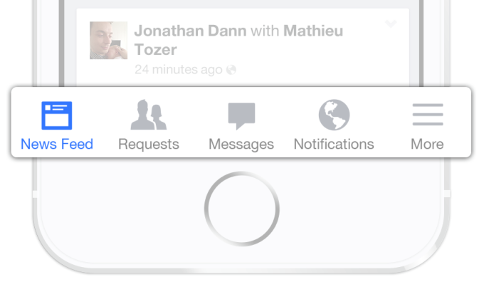
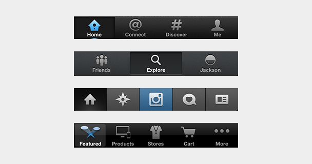

 Other popular apps sporting tab bars on iOS include Twitter, Instagram, Pinterest, Uber, Skype, WordPress, Quora, and the App Store. Many of them used to be saddled with hamburgers but came to their senses. Gmail, Google Maps, Pocket, TechCrunch’s own app, and many more still use the dreaded icon
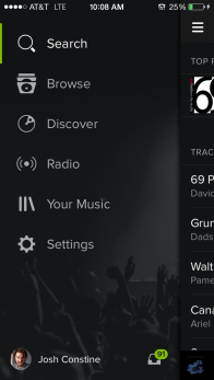